I recently wrote a quick piece on rendering and its implications for architecture (particularly competitions and such). In that piece I bragged about being smart one day a week. It turns out, and this might not come as a shock, that Arthur Erickson was smarter than I am. Or perhaps he spent more than one week writing a lecture he delivered at McGill University.
Let me find a link. What he notes about the practical and theoretical problems with using photography to document and communicate ideas about architecture is something I missed completely. You can only photograph positive objects - things that have a physical existence. You can take a picture of a wall but you can't take one of the space it delineates. So what architectural photography ends up being is a catalogue of floors, walls, ceilings, and (most particularly) stairs. Architects and photographers love stairs. There are whole books dedicated to stairs. I was going to add a whole bunch of links but it's too depressing. The reason both architects and photographers love stairs is they are the only sculptural objects in most buildings. Space, on the other hand, is neither sculptural nor an object. Yet it is absolutely essential to architecture.
The inability to photograph what isn't there goes a long way to explaining why certain architects have exploded in popularity in the last couple decades. It is surface that makes good pictures so the most interesting surfaces get photographed most frequently, and consequently published most frequently. I guess this is yet another symptom of the Bilbao Effect. Significantly, I'm not saying architects who produce buildings that photograph well (Gehry, Calatrava, etc) are producing bad buildings. I'm saying the fact they photograph well doesn't enable one to judge. I've seen a million pictures of Bilbao and the only reason I think it is probably a very great building is that people I know and trust have been there and told me it is.
To be clear, no matter what grandiose claims architects might make architecture does not create space. What it can do and, at its best does very well, is something like defining space. Define isn't the right word - what I am looking for is a word that captures precisely what a haiku does to (or for) its subject. I wanted to find some pictures of Erickson buildings to illustrate what I'm on about but I don't know his work that well. Instead, I'll chose an extremely famous building - Mies van der Rohe's Farnsworth House.
Almost all pictures of Farnsworth are taken from the outside. I think that's because their isn't much inside to photograph. Here's an example. Despite the complete lack of walls, the photographer can't help documenting what is inside the building.
It's almost like the view through the enormous windows was a photo-realistic wallpaper. This is documentation of "what there is" despite the fact the whole point of the building is that it's transparent. I found another image online - I have no idea who is in it and for that I apologize because it's a really great shot.
This might not be a very good photo. It's a terrible photo in terms of documenting the building. But the person behind the camera actually gets the point of the design. He can't even put the person in the center of the frame. The house is yelling at this guy, "Look where you are!!!" He doesn't care about the Barcelona Chair or the travertine tiles. He's taking a picture of the river through the trees. I love it.
Since I bailed out of trying to explain architecture's relationship with space by referencing haiku (and since "borrowed views" are an established technique in Japanese architecture) I should show you my favourite example of "created space" - Tadao Ando's Church on the Water:
I wish I could credit the photographer - I found the image on Ando's Pritzker webpage. There is almost nothing here to photograph - in the sense of positive objects - just a floor and ceiling. But what this image captures better than any other I've seen is the sense of precariousness created by the space. That edge is so unnaturally severe the result is a palpable tension. It isn't unpleasant (and I certainly don't think it would be as unpleasant space to be in) but you wouldn't fall asleep during the service.
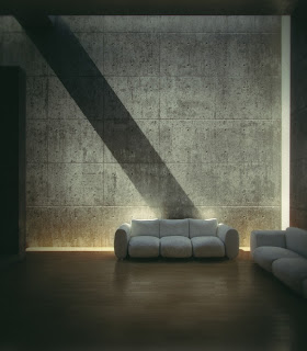
Ando has an unmatched hand at creating non-things that can be photographed. For example, the Koshino House:
Again, barely anything actually there. Floor, walls, ceiling, and two super-puffy sofas. But the light not only illuminates and charges the space, it forces it into your awareness the same way a poem can charge ordinary objects with special meaning. The extreme contrast between the light wall and the surrounding darkness also forces an awareness of the space of the room.
Since I've tried to give actual illustrations for my points I am forced to admit this isn't the best argument against the influence of rendering in architecture. A talented renderer could have created all these images (except the candid of the guy in the chair). I can only hope the points the illustrations support clarify my argument (which, it bares remembering, is actually Arthur Erickson's argument).


No comments:
Post a Comment